Champagne and Beige Wedding Motif: 11 Neutral Palettes
Friday, October 23, 2026
Quick answer
Champagne is a very pale yellowish-orange (#F7E7CE on Wikipedia) close to beige, and ivory is an off-white (#FFFFF0). Neutrals read flat on camera, so add one accent, texture and a step of depth. Give the wedding party a deeper champagne or taupe, and keep ivory and cream for the bride and the principal sponsors.
Champagne, beige, ivory and nude sound like one color, yet a florist, a tailor and a photographer will each hear a different one. This guide pins the names to hex codes, gives eleven neutral palettes with one accent, a per-role table that keeps your entourage from blending into the bride's gown, notes on barong and piña, and a way to show the motif on a digital invitation. You can copy the palettes and the test steps as they are. This guide is about the color champagne, not the drink.
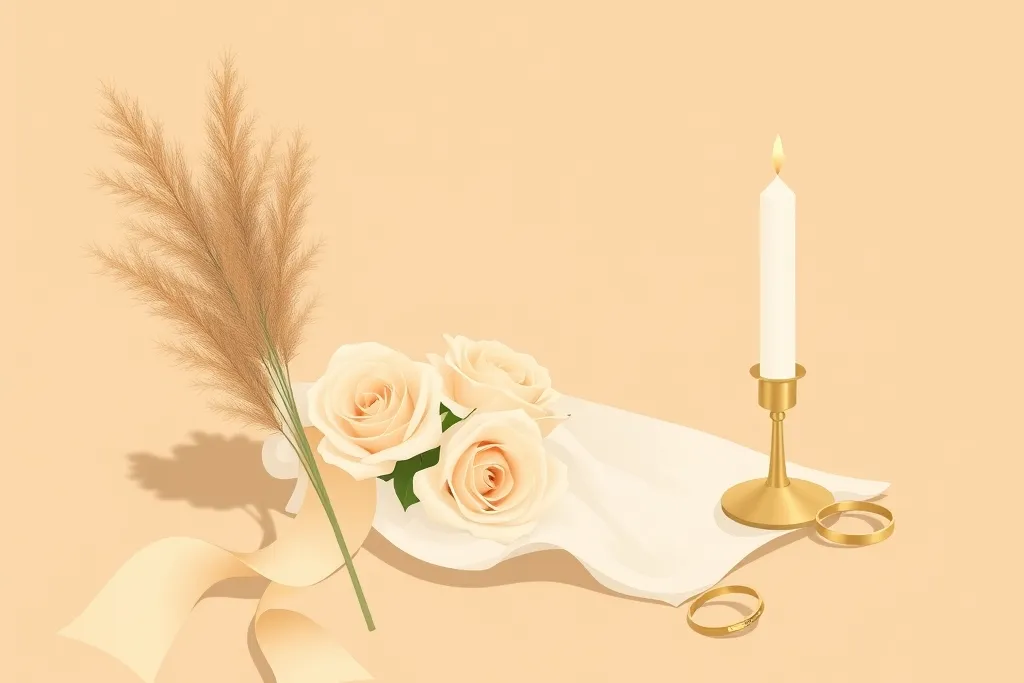
Champagne vs beige vs ivory vs nude: the hex codes
The names overlap, so the numbers help. Wikipedia describes champagne as "very pale tints of yellowish-orange that are close to beige" and gives #F7E7CE. Its beige page calls beige "a pale sandy fawn color" or "a grayish tan" and lists the web color at #F5F5DC. Its ivory page calls ivory an off-white with "a very slight tint of yellow" at #FFFFF0.
| Name | Hex | What the source says | Our note for suppliers |
|---|---|---|---|
| Champagne | #F7E7CE | Very pale yellowish-orange, close to beige (Wikipedia) | "Light, warm gold-cream" |
| Beige (web color) | #F5F5DC | Pale sandy fawn or grayish tan (Wikipedia) | Looks yellow-green on screen; fabric beige is browner |
| Beige (our example) | #E5D5BC | Our own example | "Sand-cream, a step deeper than champagne" |
| Ivory | #FFFFF0 | Off-white with a very slight yellow tint (Wikipedia) | "Near white, warm" |
| Nude | No standard hex | No source gives one | "Close to the wearer's skin"; set it per person |
| Taupe (our example) | #C8B6A6 | Our own example | "Gray-brown, the deepest neutral here" |
| Gold (accent) | #D4AF37 | ThePerfectWedding.com's approximate hex; says champagne is "more muted and neutral than gold" | "Metal accent, not a dress color" |
ThePerfectWedding.com says champagne is "warmer and softer than beige, but more muted and neutral than gold." For this guide the beige is #E5D5BC and the taupe is #C8B6A6, both our examples. Screens shift color, so send the code plus a physical swatch.
Why neutrals need texture and contrast
Neutral colors sit close together in value, so a champagne dress beside an ivory one can look like one blur in a photo. A couple in a Bride and Breakfast feature, whose palette was gray-led with nude and taupe on the entourage, said: "Since neutral colors tend to be a little bland, we decided to make the entourage wear different shades to make it more vibrant and lively especially in photos."
ThePerfectWedding.com says to treat champagne as a base and let one accent lead. Wedding stationer Written By Emily pairs a champagne and terracotta palette with "natural, organic textures such as linen and silk ribbon". Bride and Breakfast also has a 2022 neutral wedding whose page does not name its colors, so neither feature is a champagne reference. The table below turns that into checks. It is our advice, not a rule, and what holds up depends on your venue.
| Problem | Fix | Basis |
|---|---|---|
| Everything is the same value | Add one deep neutral, such as taupe, or one accent | Our advice |
| Colors flatten in photos | Vary the shade across the group, as the couple above did | Bride and Breakfast couple |
| Fabric looks plain | Mix satin, linen and chiffon | Our advice |
| Neutrals vanish on pale walls | Add gold, greenery or a dark accent | ThePerfectWedding.com (base plus one accent) |
| Skin looks washed out | Hold each swatch against skin in daylight | Our advice |
11 neutral palettes with one accent
These combinations and hex codes are our own examples, not a paint brand's. Order is base neutral, support neutral, deep neutral, accent; in the Ivory rows the ivory is the base. The "Suits" column gives setting and time of day, and both it and "Watch out" are our advice, not sourced rules. In Philippine heat, dark accents such as navy, black, burgundy and charcoal work best in the evening or indoors.
| Palette | Hex codes | Suits | Watch out (our advice) |
|---|---|---|---|
| Champagne and gold | #F7E7CE · #FBF8F2 · #6B5B45 · #B08D4F | Church, evening ballroom | Gold on champagne is low contrast, so add the deep neutral |
| Beige and sage | #E5D5BC · #F6F0E4 · #6F6150 · #9CAF88 | Garden, morning to mid-afternoon | Keep sage the only color |
| Sand and terracotta | #D8C3A5 · #F4EBDD · #5E4B3C · #C96A4B | Rustic, beach, late afternoon | Limit terracotta to two big items |
| Ivory and navy | #F4EFE3 · #D8C3A5 · #8A7A66 · #1F2F55 | Church, evening | Navy works best on the groom and best man only |
| Taupe and dusty rose | #C8B6A6 · #F6EFE6 · #7A6558 · #D4A5A5 | Garden, daytime | Pink can wash out beside taupe |
| Champagne and emerald | #F7E7CE · #E8DCC6 · #5C5043 · #0F6B4F | Evening, heritage venue | Emerald can dominate, so keep it small |
| Champagne and blush | #F7E7CE · #FBF8F2 · #7A6558 · #E8C9C0 | Church, daytime | Blush and champagne can read the same |
| Ivory and charcoal | #F4EFE3 · #E5D5BC · #3A3A3C · #B08D4F | Modern, evening | Charcoal suits are heavy at midday |
| Champagne and black | #F7E7CE · #FBF8F2 · #1C1C1E · #B08D4F | Formal, indoor evening | Black pairs with champagne for formal looks (ThePerfectWedding.com); keep it to suits |
| Champagne and dusty blue | #F7E7CE · #FBF8F2 · #6B5B45 · #8FA9C4 | Garden or church, daytime | Check the cool blue beside warm champagne in daylight; see our dusty blue guide |
| Champagne and burgundy | #F7E7CE · #FBF8F2 · #6B5B45 · #6D1F2F | Church, evening | Dark red is heavy at midday; see our burgundy guide |
If you are still choosing colors, start with our wedding colors guide. For a green accent, see our sage green wedding motif guide and emerald green wedding motif guide. For blue or deep red, see our dusty blue wedding motif guide and burgundy and maroon wedding motif guide.
Who wears what: neutrals by entourage role
Rows follow the groups in Imbitasyon Ko's entourage editor, with its role names. Sources are named per row, and the rest is our suggestion. The goal is to avoid blending with the bride's gown, whatever shade she picks.
| Role | Neutral suggestion | Keep it distinct (our advice) |
|---|---|---|
| Parents of the Groom, Parents of the Bride | Match the palette without overshadowing the couple (Casa Barong) | A deep neutral or taupe accent |
| Principal Sponsors | Cream or off-white gowns; neutral, subdued barongs or tuxedos (Nuptials.ph) | Keep these lighter than the wedding party |
| Best Man | Deep neutral tie or pocket square | One shade deeper than the groomsmen |
| Maid of Honor | The bridesmaids' shade, or one step deeper | A different fabric from the gown |
| Candle Sponsors, Veil Sponsors, Cord Sponsors | Cream, off-white or a quiet neutral; secondary sponsors have more freedom (Nuptials.ph) | Avoid the bridesmaids' exact shade |
| Groomsmen | Same color family, simpler than the groom's (Casa Barong) | Tan, taupe or a light champagne barong |
| Bridesmaids | One shade or fabric (Casa Barong); a deeper champagne, beige or taupe is our suggestion | At least one step deeper than the gown |
| Ring Bearer, Coin Bearer, Bible Bearer | Small barong in the palette | One deep accent such as a sash |
| Flower Girls | Neutral dress with an accent sash | Accent color on the sash |
| Source | What it says | Our reading |
|---|---|---|
| Nuptials.ph | "the ninangs should not wear the color motif of the bridesmaids and flower girls"; cream or off-white gowns recommended | Sponsors' cream sits next to champagne bridesmaids, so keep a clear step |
| Casa Barong | "Unless the invitation says otherwise, avoid wearing plain white if it may look too bridal." Ivory and cream can suit barongs | Put the wedding party a shade deeper than the gown |
Full attire guidance is in our entourage attire guide.
Piña and barong are already neutral
A barong brings its own color. Heritage Barong says piña "exhibits a yellowish or light champagne-gold hue" and that cocoon and jusi have a natural color of off-white. Casa Barong says common wedding barong colours are "ivory, cream, beige, champagne, light grey and soft neutral tones". So a barong is often already inside a champagne motif.
| Option | How it works | Our take |
|---|---|---|
| Barong as the neutral | Count the barong as champagne or ivory and add one accent elsewhere | Simplest for a mixed group |
| Barong with deeper dresses | Women in taupe or deeper beige, men in barongs | Clear two-tone look |
| Tonal piña and champagne | Piña barongs with champagne dresses | Hold both beside each other first |
| Accent on small items | Tie, sash, boutonniere or ribbon | Avoids a second competing neutral |
Piña and jusi sit in the same yellowish-to-off-white range as champagne, so test the dress against the actual barong swatch. For heritage themes, see our Filipiniana wedding theme guide.
Flowers and decor for a neutral motif
ThePerfectWedding.com suggests cream and blush roses, ranunculus and peonies with greenery, plus dried pampas and bleached foliage for texture. For tables it suggests ivory linens, crystal or gold-rimmed glassware and taper candles, and for stationery a champagne or ivory base with gold foil. We make no claims about what is in stock or how much it costs on your date, so ask your florist.
| Item | Neutral idea | Basis |
|---|---|---|
| Bouquet | Cream and blush roses with greenery | ThePerfectWedding.com |
| Texture | Dried pampas, bleached foliage | ThePerfectWedding.com |
| Table | Ivory linen, taper candles, gold-rimmed glassware | ThePerfectWedding.com |
| Contrast | One dark runner, napkin or ribbon | Our advice |
| Heat and humidity | Test fresh flowers at the venue first | Our advice |
Test neutrals in seven steps
Neutrals fail quietly: they look fine on a swatch card and flat in photos. These steps are our advice.
- Order a physical swatch of every shade, and borrow a dress if you can.
- Hold all swatches together in daylight at ceremony time and photograph them.
- Photograph them indoors in the ceremony venue with its lights on.
- Add the bride's gown, or a swatch of it, to the same photo.
- If two shades merge, move one a step deeper or lighter.
- Pick one accent that differs in value, not just hue.
- Fix the shades as hex codes and send the same photo to every supplier.
Show the neutral motif on the invitation
Imbitasyon Ko has no theme named beige, but several warm light themes suit a neutral motif. Each theme's palette is fixed.
| Theme | Category | Palette note |
|---|---|---|
| Ivory & Gold | Catholic Elegant | Warm ivory #FBF7EF with gold #A6802E; Free plan |
| Champagne Cathedral | Catholic Elegant | Warm champagne cream #F7F1E6 with gold #B08D4F; Standard theme |
| Sampaguita | Filipiniana | Warm off-white #FBF8F0 with deep gold #8F7430; Free plan |
| Capiz Shell | Filipiniana | Pearlescent #F5F3EE with bronze #7D6244; Standard theme |
| Minimal Ivory | Modern Minimal | Warm white #FAFAF8 with black text; Free plan |
Marble & Gold is a cooler pearl white (#F4F5F7), so it suits a champagne motif less well. You can browse all themes and filter by the Neutral or Gold color family. The motif is set separately from the theme:
| Setting | What to know |
|---|---|
| Where | The editor's Dress Code & Motif section |
| Limit | Up to six colors, from presets or a custom color |
| Presets | Sage, Dusty rose, Champagne, Navy, Terracotta, Emerald |
| Champagne | A preset (#F7E7CE) |
| Beige, ivory, taupe | Use the custom color picker |
| Pale swatches | Hard to see on a pale page, so add a deeper shade such as #C8B6A6 and check on a phone |
| Printed line | With swatches, the invitation prints "We would be delighted to see you in our motif colors" above them; do not repeat it in your note |
Say what you want guests to do, because swatches alone do not. These are plain dress code notes for you to adapt. Use the first with swatches; it adds the neutral option rather than repeating the printed line:
Our motif is champagne, taupe and soft gold. Please wear it or any soft neutral.
Use the second only if you add no swatches, because with swatches the invitation already asks guests to wear your motif colors:
Our champagne and taupe belong to the wedding party. Please wear another color.
For fuller wording, see our dress code guide, and for picking among light themes, our invitation theme guide.
Lock the shades before anyone shops
Pick two neutrals and one accent, treat the barong's warm off-white as a neutral you already own, and put the wedding party one step deeper than the bride's gown. Give principal sponsors cream rather than the motif shade, fix every shade as a hex code, and put the same swatch photo in every supplier's hands before the entourage buys.
Frequently asked questions
What is the difference between champagne and beige?
Wikipedia describes champagne as very pale tints of yellowish-orange close to beige (#F7E7CE), and beige as a pale sandy fawn or grayish tan (#F5F5DC for the web color). ThePerfectWedding.com calls champagne warmer and softer than beige. In practice, send a hex code and a swatch.
What colors go with a champagne wedding motif?
ThePerfectWedding.com pairs champagne with gold, blush, dusty blue, sage, ivory, black, emerald and burgundy, and treats champagne as the base with one accent leading. Our palette table gives hex codes for eleven neutral combinations with one accent each.
Is a champagne or beige motif too plain for a wedding?
It can look flat, because neutrals sit close together in value. One couple in a Bride and Breakfast feature said neutral colors tend to be a little bland, so they had the entourage wear different shades. Add one accent color, texture and a step of depth.
What should principal sponsors wear with a champagne motif?
Nuptials.ph says ninangs should not wear the bridesmaids' and flower girls' color motif and recommends cream or off-white gowns, and neutral, subdued barongs or tuxedos for ninongs. With a champagne motif, give the wedding party a deeper shade so sponsors still stand out.
Can the entourage wear champagne if the bride's gown is ivory?
Yes, but keep a visible step between them. Casa Barong says to avoid plain white if it may look too bridal. Our advice: put bridesmaids a shade or two deeper than the gown and check both in one photo before anyone buys fabric.
Is a piña barong already a neutral color?
Largely, yes. Heritage Barong says piña has a yellowish or light champagne-gold hue and that cocoon and jusi are naturally off-white. Casa Barong lists ivory, cream, beige, champagne and light grey among the most common wedding barong colours.
Does Imbitasyon Ko have a champagne color for the motif?
Yes. The Dress Code & Motif section has a Champagne preset (#F7E7CE) among its six presets. There is no beige, ivory or taupe preset, but you can add a custom color, up to six motif colors in all. Champagne Cathedral is a Standard theme in warm champagne cream.